Pages

Friday, October 30, 2015

LET ME BE FRANK


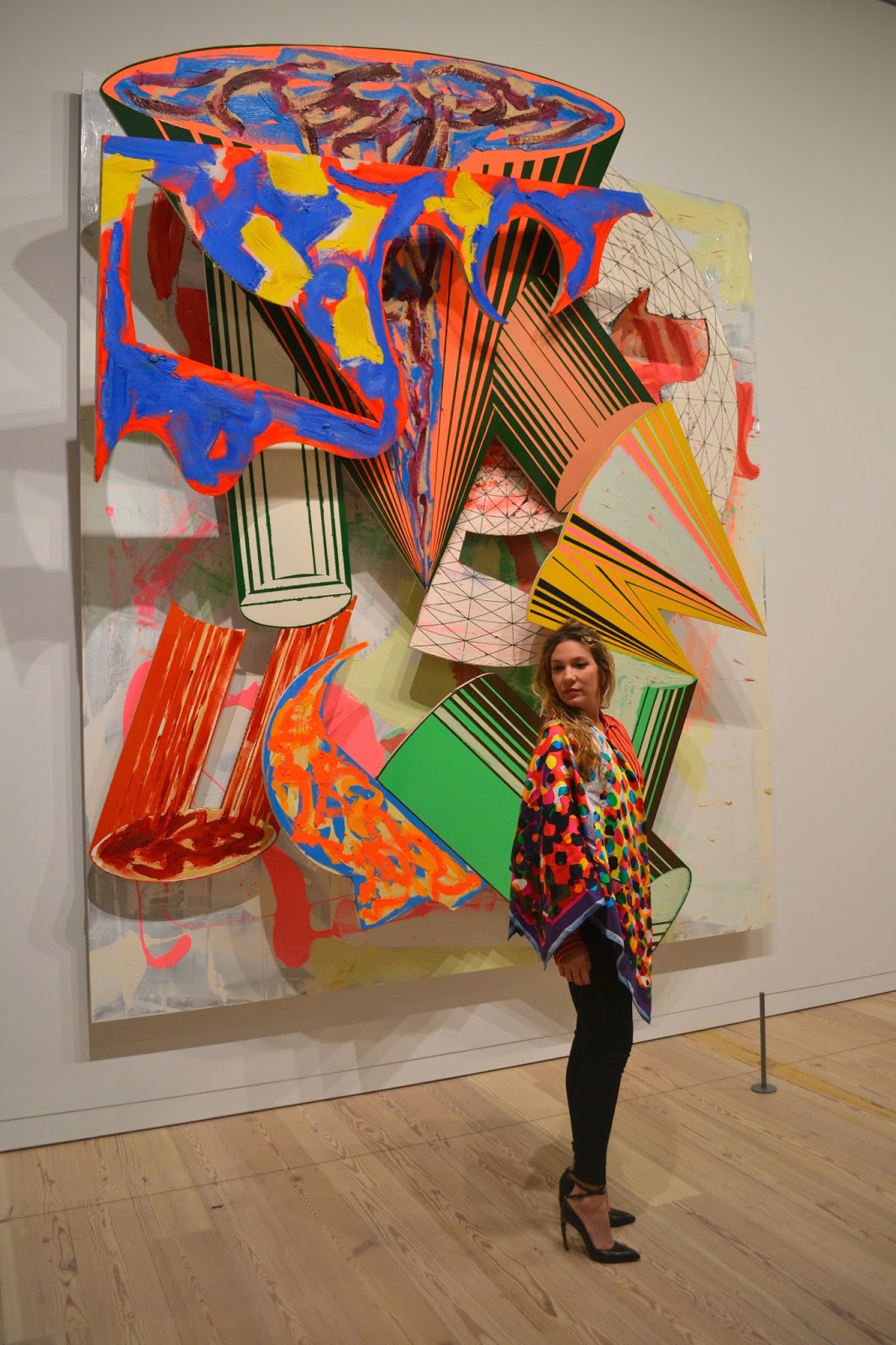
"I don't like to say I have given my life to art.  I prefer to say art has given me my life."  -Frank Stella
As I was perusing the textile rack at a local secondhand store a few years ago, I came across what I could only describe as the most beautiful piece of silk I'd ever seen - which I immediately recognized as a Frank Stella print.  Upon closer inspection, I found Stella's signature and the date, and clutched the scarf to my chest as I raced for the cash register, thinking the beautiful piece of silk would vanish from my hands before I could buy it.  I did a bit of research and found that the scarf was one of a limited edition of 500 produced by Stella for Barneys in 2004.  One of my prized possessions, I couldn't wait to wear the scarf for the opening of Frank Stella's retrospective at the Whitney Museum.

Stella is one of those art world luminaries who has been living and creating art throughout so many different time periods and movements, that it is difficult to categorize his work.  He is most well known for his Minimalist works of the 1960s and 1970s, but his more recent work (which I can comfortably describe as Maximalist) has become more and more interesting over the years.  The Whitney retrospective gives a high level overview of the artist's oeuvre and delves into some of the pervading themes and just touches on some of the others.

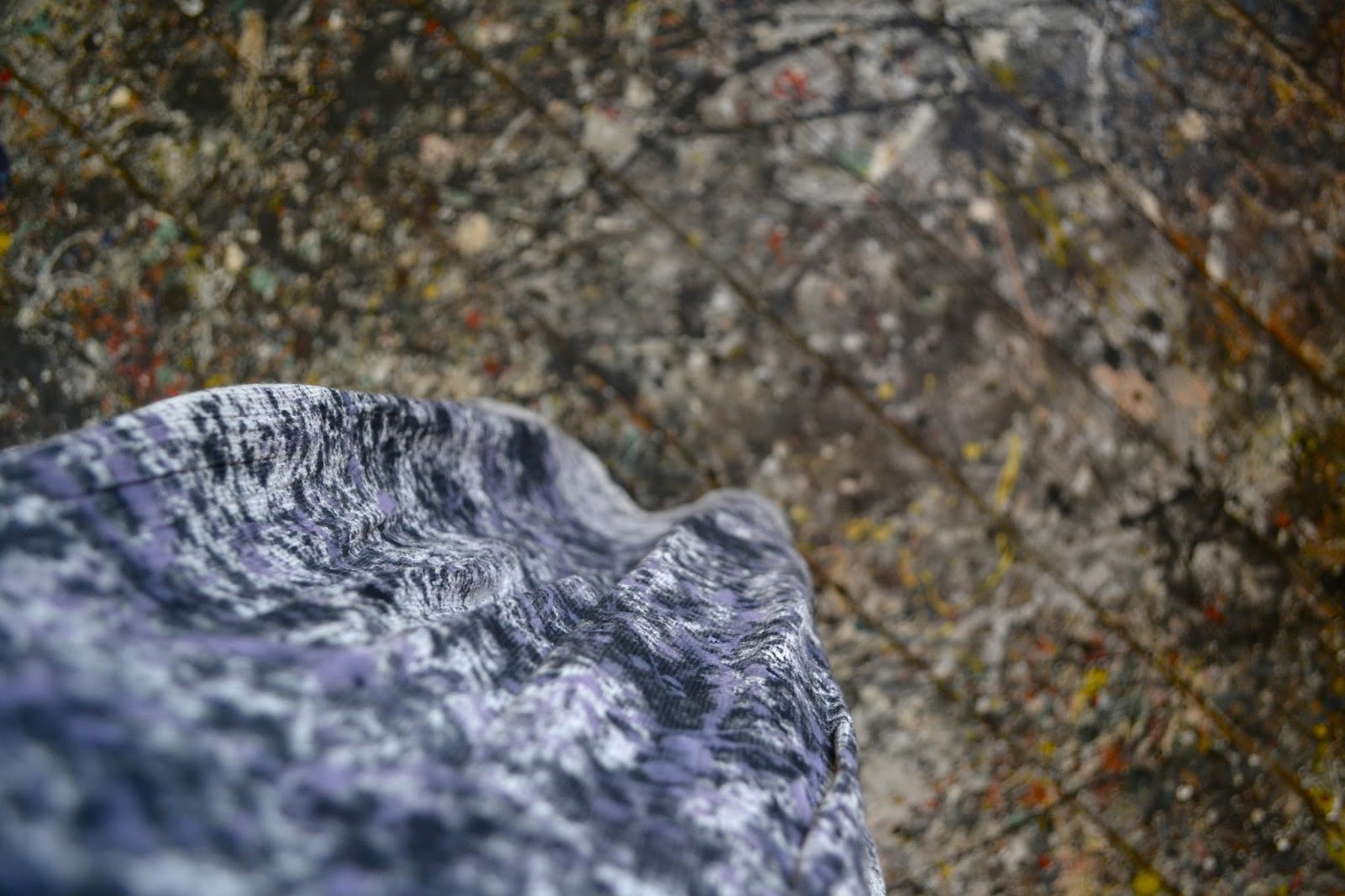
Silk scarf: Frank Stella Limited Edition for Barneys
Silk blouse: Yves Saint Laurent
Shoes:  Walter Steiger

Photos of me by Meri Feir; other photos by me.

Tuesday, October 27, 2015

KELTIE FERRIS


This is the work of an artist who isn't afraid to tell painting "I love you."*

I discovered the work of Keltie Ferris in 2012, at her first solo exhibition with Mitchell-Innes & Nash.  I immediately fell in love with the intense color palette and her fresh mark-making.  At her second exhibition with the gallery, there was even more to love: Ferris's work combines so many different ways of getting the paint onto the canvas (even using her body as a means of transport) and the color palette was even more euphoric; somewhat like my mood after experiencing her latest work.

Blouse and pants: Diane von Furstenberg
Leather vest: Yigal Azrouel
Handbag: Milly

*from The New Yorker review.
Photos by Kathy Paciello.

Tuesday, October 20, 2015

ART AND FASHION


When I met E.P. Cutler at a Fashion and Street Culture symposium in 2011, I was blown away by her knowledge of everything fashion related and sharp wit.  We've stayed in touch over the past few years, and I've watched her accomplish marvelous things as a writer (she published PANTONE on Fashion: A Century of Color in Design in 2014), and I couldn't be more excited to announce the release of her newest book, Art + Fashion: Collaborations and Connections Between Icons.  Combining my two favorite topics, the book covers every important fashion and art collaboration; from Cecil Beaton and Jackson Pollock, to Mary Katrantzou and John Chamberlain, to Prada and Elmgren + Dragset.  I can't think of another volume that better reflects my interests.  It brings me great joy just to leaf through the glossy pages at a compilation of so many beautiful and significant creations from the intersection of the two worlds I most love.

Congratulations to my dear friend Elizabeth.  You can buy the book here.

Monday, October 19, 2015

POLLOCK KRASNER HOUSE


After an enjoyable afternoon impersonating Pollock on the roof of my building, I was ready to make the trek to East Hampton to the Pollock Krasner House & Study Center. 

I’d been wanting to visit the historic place for at least ten years (probably as long as I’d known that it exists and is open to the public), so it was quite a treat to pile into a car with three of my friends and hit the road on a lovely autumn morning.  After about a 2.5 hour drive from Brooklyn, we pulled up to a wooden-shingled farmhouse in an absolutely beautiful setting with a view of the river and marshes.

After a warm reception from our very knowledgeable and hilarious tour guide, Myrna, we were welcomed into the barn, which had served as Jackson Pollock’s studio, and then Lee Krasner’s after his death.  After removing our shoes and donning foam slippers, we entered the space, which was filled with light, photographs, and ephemera from both of the artists’ careers.  It was truly overwhelming to walk through the space where Pollock had created such masterpieces as Autumn Rhythm.  The most poignant part of the experience was looking down on the paint drips and splatters, records of Pollock’s action painting practice and still completely intact.  You could even see outlines of specific paintings if you looked closely. 

After spending a long time in the studio, we took a tour of the house, which included the couple’s collection of books, records, and even their monogrammed suitcases.  As a fan of AbstractExpressionism, it was so interesting to see the chattels of two of the movement’s greatest members, and further understand and appreciate their relationship, both personally and creatively.

The Pollock Krasner House is closed during the winter, but reopens in the spring by appointment.

Leather jacket: DKNY (also worn here, in my Pollock post from New Year's 2011!)
Scarf: Vintage
Tights: Hue

Photos of me by Micah Bozeman and Emily Hoerdemann and other photos by me.

Thursday, October 15, 2015

ACTION PAINTING


Hans Namuth photograph of Jackson Pollock, 1950

Hans Namuth photograph of Jackson Pollock, 1950


Hans Namuth photograph of Jackson Pollock, 1950


It was a stunning fall day; the type of day which makes you feel guilty for doing anything but frolicking outdoors.  I'd been wanting to do an action painting project for a while, and with a visit to the Pollock Krasner House & Study Center upcoming, it was time to make something to wear.  After looking through countless photographs of Jackson Pollock creating his drip paintings (most of them taken by Hans Namuth ca. 1950), I was ready to embark on my own paint-flinging experience.

First, I found a dress at the thrift store in a thick cotton fabric which resembled canvas.  I used an old sheet as a dropcloth, and spent some time mixing acrylic paint to the right consistency.  (Pollock used house paint.)  Then I took everything up to the roof of my building, set up my camera and tripod, and went to work.

I used one of Pollock's most famous paintings, Number 1, 1950 (Lavender Mist), as my inspiration, and created multiple layers of black, some white, and a lavender color.  I waited for each color to dry in between layers so they wouldn't mix and become muddy.

Overall, it was an extremely fun project and a great stress reliever!  I left the back of the dress unfinished, because some of the paint bled through and it reminded me of what the back of a painting would really look like.

On a side note, I've had great difficulty finding out how to attribute Namuth's photographs of Pollock.  It seems that many of them are courtesy of the Namuth Estate, and most are copyrighted 1950.


Photos by me; Pollock photos from various sources, all courtesy of the Hans Namuth Estate.

Tuesday, October 13, 2015

PICASSO SCULPTURE


On Sunday, I ventured uptown through the Guatemalan Independence Day parade to see the blockbuster Picasso Sculpture exhibition at MoMA.  What awaited me was an expansive, varied journey through the artist's career and his work in three dimensions.  There were a few things that struck me:
1.  Many of the sculptures were smaller than I would have guessed.
2.  Much of the three dimensional work was very different formally than his paintings (albeit with similar subject matter).  However, I would have liked to see some paintings from concurrent time periods alongside the sculpture to provide a comparison.
3.  Picasso was a master of all media; though he was never formally trained as a sculptor, his work in difficult materials such as bronze was remarkable.

The exhibition is on view through February 7th.

Trench: Burberry (also worn here)
Jeans: Levi's
Boots: Rachel Comey

Photo of me by Meri Feir; all other photos by me.

Thursday, October 1, 2015

THE DISAPPEARING MURAL


It’s no secret that I’m a fan of Roy Lichtenstein (case in point here, here, and here), and I’ve never been one to miss a good disappearing mural.  Hence, I made it a priority to visit Lichtenstein’s Greene Street Mural at Gagosian before it is destroyed, for the second time, on October 17th.

Lichtenstein originally painted the mural at the Castelli Gallery in 1983, and mandated that it be destroyed following a 6 week showing.  Working in accordance with the artist’s estate and his former studio assistant, Gagosian recreated the mural for a second time around.  The work features imagery found throughout Lichtenstein's career, as well as references to Picasso, Brancusi, and, of course, Pop Art.  It is the closest to a survey of Lichtenstein’s oeuvre that one work could possibly be.

The mural is on view at Gagosian Gallery on 24th Street until October 17th.

Shirt: Jones New York
Pants: Hussein Chalayan
Shoes: Walter Steiger
Handbag: Milly
Trench: Burberry


Photos by Hilary Pollack.