Pages

Thursday, January 13, 2011

BAKER OVERSTREET


As previously discussed, although it's the coldest time of the year on the East Coast, I can't help but look forward to spring. As an attempt to stave off the winter blahs, I've been wearing some of the brightest colors I can (so far evidenced here and here).


Hence, I was delighted to find out (somewhat late) that it's Rainbow Tights Week in the blogging world!


I decided to go for a tribal look, pairing my favorite Windjammer tights (last worn here) with pieces inspired by one of my favorite contemporary artists, Baker Overstreet.


Overstreet is a relatively young artist that I first encountered at his Follies exhibition in New York at Fredericks & Freiser. I was immediately enamored of the large scale works, which function as tableaux of color and shape.


Overstreet completed an MFA at Yale in 2006, and his work has steadily gained popularity over the past 5 years.


He was recently included in the "Abstract America" show at Saatchi Gallery in London, which solidified his international presence.


Overstreet's bold, colorful works are clearly inspired by primitivism and a tribal aesthetic. It is interesting to note the way he creates depth in the otherwise flat works by the placement of contrasting colors.


Overstreet's most recent work has moved into performance art, with his alter-ego June Fagley as the star. His paintings still play an important role in his performance art, acting as advertisements for the show.


For this outfit, I combined a few of the brightest colors from Overstreet's paintings with an amazing embroidered vest that was a recent thrift find.


I'm wearing a vintage Mexican wool vest, vintage leather skirt, Zehana Outfitters turtleneck, Topshop tights, Jeffrey Campbell boots, and a necklace that was a gift from Greece (Thanks, Kris!).


Many thanks to Angel.Pearls for the Stylish Blogger award nomination!


[Overstreet images from enantiomorphic.blogspot.com, artnet.com, contemporaryartlinks.blogspot.com, avigupta.com, and saatchi-gallery.co.uj, respectively.]

Sunday, January 9, 2011

SHAPES OF STELLA


Now that the holidays are over, it's officially the "bleak midwinter". With little to look forward to until spring (read: my birthday), it's easy to get into a wardrobe rut. I'm of the opinion that it's possible to beat the midwinter blahs through a well-planned wardrobe.


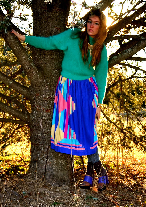
Although it's still absolutely necessary to layer up, it's fun to experiment with color palettes that wouldn't normally be associated with the cold season. This ensemble was inspired by the colorful minimalist works of Frank Stella.


Stella (b. 1936) is an American painter and sculptor most closely associated with the Minimalist movement.


During his early career, Stella was interested in making pictures that were art objects in and of themselves, not pictures that depicted something else.


Stella's early works were very minimal: simple unprimed canvas with black paint, in some cases. These works are from the 1960s to 1970s and represent Stella's experimentation with color and shaped canvases, which further complicated the work's status as object versus depiction.


Minimalism like Stella's came to be a representation of the 1960s aesthetic, as seen in art, architecture, home decor, and fashion.


Although minimalism has lost some of its caché in recent years, it represents an important art historical movement that developed in response to Abstract Expressionism.


This vintage skirt was a recent thrift find, and I thought it bore a striking resemblance to the colors and patterns of Stella's paintings.


For me, the colors of this outfit (and smart layering) made a chilly midwinter day a bit more bearable.


I'm wearing a vintage skirt (which I will probably shorten and wear to death this summer), vintage cashmere/angora sweater, Betsey Johnson wool tights, unidentified wool socks, a necklace from Burlington Coat Factory, and Marni clogs. (Not shown: thermal undergarments--a necessity!)


[Stella images from kingfishers.ednet.ns.ca, waynethomasartroom.wikispaces.com, artistquoteoftheday.wordpress.com, and abstract-art.com, respectively.]

Thursday, January 6, 2011

BLACK, WHITE, AND RED ALL OVER


Sometimes wearing black, white, and red seems like a cop out. It's just so easy and possibly a bit predictable, but it is an undeniably powerful color combination. It packs a ton of contrast, which in turn, is extraordinarily eye-catching.


This is one of the main reasons why the color triumvirate was championed by the Russian Constructivists, a post-World War I art movement.


Active from around 1919-1934, Russian Constructivism purported the use of art for social means, including propaganda and promotion of technology.


Beat the Whites with the Red Wedge, by El Lissitzky, is one of the most well-known Constructivist posters. Aleksandr Rodchenko's Constructivist posters were also central to the movement.


The Constructivist architect Vladimir Tatlin was lauded for his model of the Monument to the Third International.


Intended to be erected in what is now St. Petersburg after the Bolshevik Revolution, Tatlin's Tower was never actually built. However, it became a symbol of the Constructivist aesthetic and championing of the technological machine age.


Above is a film poster by the Steinbergs. Constructivism owed much to the Suprematism of artists like Kasimir Malevich.


The influence of Constructivism is still apparent today, especially in street art (think Shepard Fairey).


For my Constructivist look, I paired an El Lissitzky-esque sweater with lots of black and a pop of red, and shot the photos at the base of an electrical tower reminiscent of the Monument to the Third International.


I'm wearing a vintage leather jacket, vintage sweater, H&M skirt, DKNY tights, and L.A.M.B. wedges.


[Constructivist images from p-adamek0912-dc.blogspot.com, mechanicrobotic.files.wordpress.com, shafe.co.uk, and forth.fi, respectively.]


Tuesday, January 4, 2011

SUNSETTING


I almost always take context into consideration when deciding what to wear. When the landscape was covered with snow, I felt it important to wear outfits that contrasted with the white background. Now that the snow has melted, I'm back to having a bit more freedom to dress according to my surroundings.


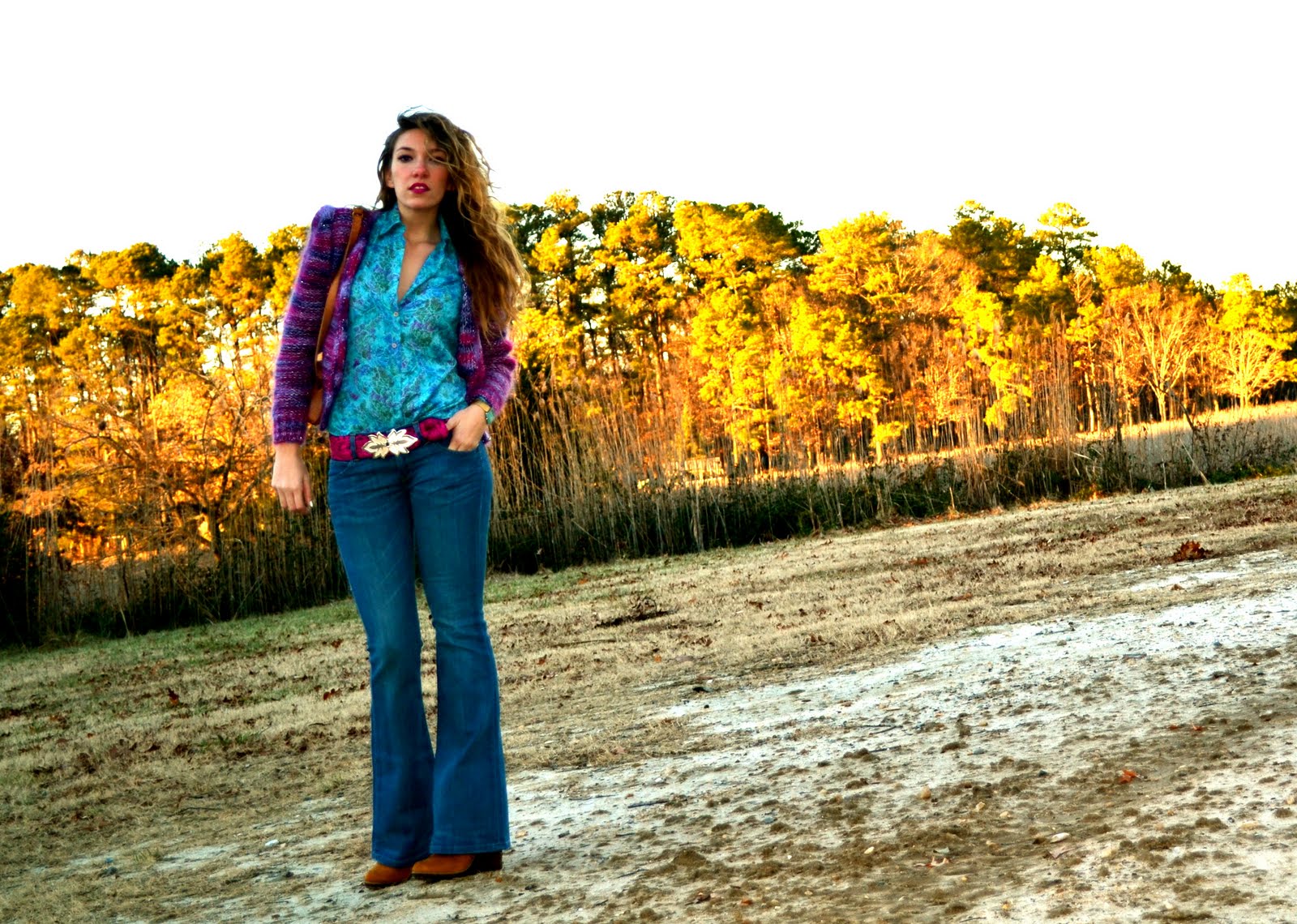
The flecks of color in this vintage cardigan brought to mind Van Gogh's infamous brushstrokes, so I decided to emulate some of his landscape paintings in the colors of my outfit and my choice of location.

It always strikes me how the sun in Van Gogh's paintings really looks like it's on fire, exactly how it appears in the last few moments before it sets, which is when these outfit photos were taken.


Van Gogh was a brilliant colorist, and I adore the way he used contrasting colors to establish space in these paintings. For example, in the work below, the highly saturated yellow versus the pastel purplish-blue give the illusion of an entire field of depth.


Although Van Gogh's life and work has been highly romanticized due to his untimely death, there is no denying that he incorporated a sense of beauty into his works that is unparalleled by scores of other Expressionist paintings.


My very favorite aspects of Van Gogh's works are the brushstrokes. As I said before, hundreds of thousands of these make up each work, and, insignificant though they may be in isolation, together they create the masterpiece of a Van Gogh painting.


"Great things are done by a series of small things brought together."
--Vincent Van Gogh


I can file this quote under my New Year's resolution to live my life like an action painting, making each stroke an important part of the whole.


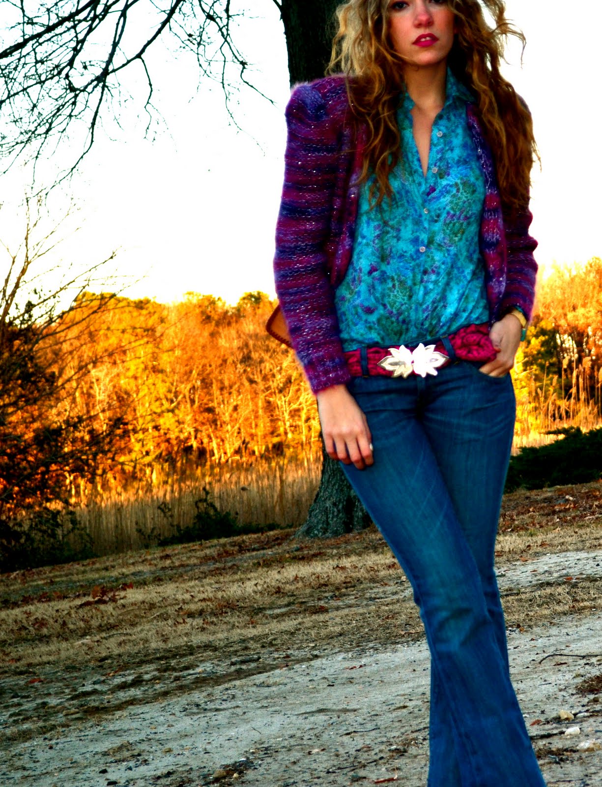
To keep with the Van Gogh theme, I wore cool colors against the fire-like reflection of the setting sun, with the addition of fuchsia, which was particularly reminiscent of Red Vineyards (the first painting in this post).


My entire outfit is vintage (metallic mohair cardigan, silk blouse, belt and belt buckle, hammered leather purse, and Levi's bell bottoms) except for the suede Zigi SoHo booties.


Also, thank you to Mode. who nominated me for the Stylish Blogger Award!
Don't forget to follow Artfully Awear on Tumblr if you're interested.

[Van Gogh images from mystudios.com, silouanthompson.net, artinvest2000.com, and nonprints.com, respectively.]
Sunday, January 2, 2011

ACTION PAINTING


Happy New Year!
I hope everyone had a fun and safe start to 2011. I'm so excited for this year--I have a sneaking suspicion its going to be a great one!


To start off the new year, I wanted to wear something festive that wasn't traditional NYE glitter and sequins. I ended up going with a Jackson Pollock-inspired look--what could be more spirited than action painting?


I had Pollock in mind when I bought this dress. Set against the backdrop of the barren trees, I though the setting evoked the beautifully haphazard layering of the paintings.


The beauty of Pollock's action paintings comes from the many layers of dripped paint and the open composition. The way the paint was applied to the canvas has a rhythmic quality that could not be achieved by easel painting.


Pollock's method of flinging paint onto a horizontal canvas changed painting forever (and signified the highest level of art to critics like Clement Greenberg).


Argued to be the earliest action painter, Pollock's notorious hard living cut his career short, but not before he created some of the most well-known and recognizable artworks of the 20th century.


I've been inspired by the Abstract Expressionists a lot recently, possibly due to the current blockbuster AbEx New York exhibition at the MoMA.


AbEx not only inspired my New Year's Eve outfit, but also my New Year's Resolution: to let go and live my life like a giant action painting--making what could seem like accidental drips or unplanned instances into a multilayered masterpiece.


I'm wearing an H&M dress, DKNY leather motorcycle jacket, Madewell necklace, Dannijo ring, and Christian Siriano x Payless "talon" shoes.


[Pollock images from felixbowker.wordpress.com, blog.cleveland.com, abstract-art.com, and blog.case.edu, respectively.]