Pages

Showing posts with label ABEX. Show all posts

Wednesday, June 1, 2016

CLYFFORD STILL MUSEUM


“You can turn the lights out.  The paintings will carry their own fire.” –Clyfford Still

In anticipation of my long-awaited sojourn to the Clyfford Still Museum in Denver, Colorado, I began reading and thinking about Still’s work: putting myself into the mind of the artist to create a garment inspired by his paintings.  I could count on one hand the number of Still’s paintings I’d seen in person, and could only imagine the quiet power of a building dedicated entirely to his life’s work.

Still (1904-1980) was a contemporary of Jackson Pollock and Mark Rothko, but unlike other artists, he eschewed the market for his work.  When he passed away in 1980, his estate included 95% of his oeuvre, most canvases shielded from the public for decades, until the Still Museum opened in 2011.

When I anxiously opened the doors to the museum, I experienced an overwhelming sense of calm.  It is a quiet, reflective space, with soft light and nuanced architectural details that perfectly coexist with the selections of the nearly 3,000 works in its collection that are on display.

Wearing my handpainted dress inspired by Still’s artwork, I experienced a heightened sense of awareness and understanding of the connection between the works and the sublime.  It’s difficult to describe the feeling of being surrounded by Still’s paintings – on the walls around me, and on my body.  Sensing the works’ symbolism of the human condition; feeling and knowing the process of creating the works of art; understanding their conservation and relation to the history of art in America and the world; the entire process awakened in me a deeper understanding of the personal impact of painting.

I made a number of friends at the museum – including a security guard who, with a wink, remarked “that would be a great way to sneak a painting out of the museum.”


I didn’t physically take a painting from the museum that day, but I feel as though I took away my own personal collection, along with a greater sense of appreciation for Still’s work.  Along with that, I refueled my desire to create, in order to achieve the higher level of enlightenment that so many have experienced through the quiet reverie of the work of Clyfford Still.

Dress: thrifted, painted by me
Sandals: Frye Brielle Gladiator (available here)
Photos by William Sealy


Monday, October 19, 2015

POLLOCK KRASNER HOUSE


After an enjoyable afternoon impersonating Pollock on the roof of my building, I was ready to make the trek to East Hampton to the Pollock Krasner House & Study Center. 

I’d been wanting to visit the historic place for at least ten years (probably as long as I’d known that it exists and is open to the public), so it was quite a treat to pile into a car with three of my friends and hit the road on a lovely autumn morning.  After about a 2.5 hour drive from Brooklyn, we pulled up to a wooden-shingled farmhouse in an absolutely beautiful setting with a view of the river and marshes.

After a warm reception from our very knowledgeable and hilarious tour guide, Myrna, we were welcomed into the barn, which had served as Jackson Pollock’s studio, and then Lee Krasner’s after his death.  After removing our shoes and donning foam slippers, we entered the space, which was filled with light, photographs, and ephemera from both of the artists’ careers.  It was truly overwhelming to walk through the space where Pollock had created such masterpieces as Autumn Rhythm.  The most poignant part of the experience was looking down on the paint drips and splatters, records of Pollock’s action painting practice and still completely intact.  You could even see outlines of specific paintings if you looked closely. 

After spending a long time in the studio, we took a tour of the house, which included the couple’s collection of books, records, and even their monogrammed suitcases.  As a fan of AbstractExpressionism, it was so interesting to see the chattels of two of the movement’s greatest members, and further understand and appreciate their relationship, both personally and creatively.

The Pollock Krasner House is closed during the winter, but reopens in the spring by appointment.

Leather jacket: DKNY (also worn here, in my Pollock post from New Year's 2011!)
Scarf: Vintage
Tights: Hue

Photos of me by Micah Bozeman and Emily Hoerdemann and other photos by me.

Thursday, October 15, 2015

ACTION PAINTING


Hans Namuth photograph of Jackson Pollock, 1950

Hans Namuth photograph of Jackson Pollock, 1950


Hans Namuth photograph of Jackson Pollock, 1950


It was a stunning fall day; the type of day which makes you feel guilty for doing anything but frolicking outdoors.  I'd been wanting to do an action painting project for a while, and with a visit to the Pollock Krasner House & Study Center upcoming, it was time to make something to wear.  After looking through countless photographs of Jackson Pollock creating his drip paintings (most of them taken by Hans Namuth ca. 1950), I was ready to embark on my own paint-flinging experience.

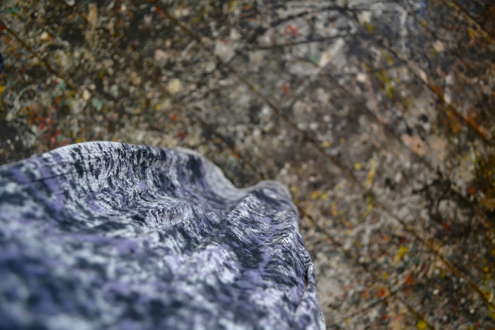
First, I found a dress at the thrift store in a thick cotton fabric which resembled canvas.  I used an old sheet as a dropcloth, and spent some time mixing acrylic paint to the right consistency.  (Pollock used house paint.)  Then I took everything up to the roof of my building, set up my camera and tripod, and went to work.

I used one of Pollock's most famous paintings, Number 1, 1950 (Lavender Mist), as my inspiration, and created multiple layers of black, some white, and a lavender color.  I waited for each color to dry in between layers so they wouldn't mix and become muddy.

Overall, it was an extremely fun project and a great stress reliever!  I left the back of the dress unfinished, because some of the paint bled through and it reminded me of what the back of a painting would really look like.

On a side note, I've had great difficulty finding out how to attribute Namuth's photographs of Pollock.  It seems that many of them are courtesy of the Namuth Estate, and most are copyrighted 1950.


Photos by me; Pollock photos from various sources, all courtesy of the Hans Namuth Estate.

Thursday, April 30, 2015

TBT: Morris Louis


I spent last weekend in Washington, DC, and visited the Hirshhorn Museum and the Phillips Collection, which both reminded me of my love for the work of Morris Louis.  The most well known Washington area Abstract Epressionist, Louis' Color Field work has always been very soothing to me.  See my post from 2011 here, wearing one of my favorite dresses (that needs to come back into rotation for spring).

Friday, October 3, 2014

ART TO WEAR: Lichtenstein Brushstroke.


Roy Lichtenstein, Brushstroke, 1965
Screenprint on paper
Pop Art looks out into the world.  It doesn't look like a painting of something, it looks like the thing itself.  --Roy Lichtenstein
Feeling gestural?  I found the perfect frock to show your love of Pop's nod to Abstract Expressionism, Roy Lichtenstein's Brushstroke at the Tate. Pair with boots and a tear in the corner of your eye, and you, too, will look like the thing itself.

Paint Strokes Black Dress, $72 at Pixie Market

Wednesday, July 10, 2013

HADIEH SHAFIE

Hadieh Shafie, Magenta (Ketab Series), 2012
I'm fascinated by the hand-dyed, rolled paper works of Hadieh Shafie (1969-), an Iranian artist who studied at Pratt.  Reminiscent of ancient scrolls, and inspired by Abstract Expressionism, the works resound on multiple levels.  When a friend sent me the above image of myself, which was enhanced using the iPhone app Percolator, I was delighted by it's affinity to the mesmerizing sculptures.

[Shafie image from artsy.net; image of me by Brett McKenzie.]

Tuesday, May 14, 2013

ARTFULLY AWEAR + PANTONE: Emerald.


After a brief hiatus, I'm back with my latest Artfully Awear + Pantone post, featuring the Color of the Year: Emerald.
Emerald has always been one of my personal favorite colors, and is surprisingly flattering with almost any skin tone. The hue is also well represented in the work of Helen Frankenthaler.


Her oversized canvases, though seemingly abstract, were often inspired by landscapes, such as her most famous work, Mountains and Sea, which measures 7 feet by 10 feet.


One of the few female artists recognized alongside the group of second generation Abstract Expressionists, Frankenthaler (1928-2011) was a Color Field painter.


The thin veils of paint that make up her paintings are reminiscent of watercolors, even though they are actually oils. Her "soak stain" method of thinning oil paint and applying to unprimed canvas was adopted by other artists including Morris Louis and Kenneth Noland.

Two of my favorite posts of all time are inspired by Morris Louis and Kenneth Noland.


Color Field painting was different from Abstract Expressionism in its denial of emotional or mythical themes.


"You have to know how to use the accident, how to recognise it, how to control it, and ways to eliminate it so that the whole surface looks felt and born all at once". --Helen Frankenthaler


Dress: Nicole Miller Artelier (full length version here for $100!)
Shoes: Calvin Klein


[Photos by @kay_elle_pea; images from stylesight.com, newcriterion.com, justalittlegreen.tumblr.com, and accidental-brilliance.com.]

Thursday, April 11, 2013

ARTFULLY AWEAR + PANTONE: Magenta Purple.


I'd like to present Magenta Purple, the first color in my Artfully Awear + Pantone series.
When I discovered this gown, featuring Magenta Purple at the yoke and gradually changing gradient, I could not overlook its relationship to the Color Field paintings of Morris Louis.


Louis (1912-1962) lived and worked for most of his career in Washington, DC, becoming central to the Washington Color Movement along with Kenneth Noland and others.


Louis is best known for his gorgeous unprimed canvases featuring specially formulated Magna Paint.


Two important series make up his artistic oeuvre, the Unfurleds and the Veil paintings, pictured here.  View my previous Morris Louis post here, from 2011.


In addition to the beautiful tissue-like quality of the layers of paint on Louis' umprimed surfaces, I've always been drawn to his use of color, and the way they interact on the canvas by overlapping and becoming more or less sheer.


Beaded handbag: Vintage, thrifted
Necklace: So Good Jewelry in SoHo

Thank you to Pantone for sponsoring this post!
Photos by @kay_elle_pea
Images from phillipscollection.org, dfwarts2010.files.wordpress.com, faculty.etsu.edu, and guggenheim.org