Pages

Showing posts with label EXPRESSIONISM. Show all posts

Tuesday, October 27, 2015

KELTIE FERRIS


This is the work of an artist who isn't afraid to tell painting "I love you."*

I discovered the work of Keltie Ferris in 2012, at her first solo exhibition with Mitchell-Innes & Nash.  I immediately fell in love with the intense color palette and her fresh mark-making.  At her second exhibition with the gallery, there was even more to love: Ferris's work combines so many different ways of getting the paint onto the canvas (even using her body as a means of transport) and the color palette was even more euphoric; somewhat like my mood after experiencing her latest work.

Blouse and pants: Diane von Furstenberg
Leather vest: Yigal Azrouel
Handbag: Milly

*from The New Yorker review.
Photos by Kathy Paciello.

Thursday, March 13, 2014

UNDER THE BLACKLIGHT


One of my favorite posts (and favorite dresses!) happened way back in 2010, with this neon ensemble inspired by Que Houxo's gestural paintings lit by blacklights.  See the original post here. #tbt

Friday, February 7, 2014

THRIFTED: Cafe Terrace At Night.


This vintage dress is possibly one of my most exciting thrift finds to date.  I remember plucking it off of the rack at a local thrift store and squealing with delight, as I imagined promptly leaving the store and heading directly for the Netherlands, where Vincent Van Gogh's Cafe Terrace at Night (1888) lives in the Kröller-Müller Museum.  Alas, I still have not seen this fantastic painting in person (which, coincidentally is not signed by the artist), but I spent an afternoon with the Van Gogh pair at MoMA, reveling in the swirls and undulations of the paintings and my outfit.


Dress: Thrifted
Tights: Joe Fresh
Boots: Delman
Bracelet: Vintage Givenchy (via Goodwill)

Photos by Kathy Paciello; Cafe Terrace image via prweb.com.

Wednesday, January 1, 2014

SHE LIKES TO PARTY


Yolanda Sanchez, She Likes to Party, 2012

HAPPY NEW YEAR!
My New Year's Eve attire was inspired by this expressionist oil on canvas work by Yolanda Sanchez, aptly titled She Likes to Party.  I hope you enjoyed time with family and friends over the holiday, and wish you all the best for 2014.

Dress: Cynthia Steffe, thrifted
Tights: Uniqlo

Photos by Lauren Ricciardi, Sanchez image via Artsy.

Monday, October 21, 2013

NOW WEARING: Clive Van Den Berg.


CLive Van Den Berg, The Land Throws Up A Ghost II, 2013
I'm finally embracing the season, inspired by the work of Clive Van Den Berg.  An "artist, curator, designer, writer, teacher, and activist", Van Den Berg produces work across media that deal with various themes from desire, to the human body, to landscape, and more.  Imbued with a sense of his identity as a South African, Van Den Berg's works are colorful representations of memory.
Jacket: Desigual
Jeans: Gap
Boots: L.L.Bean
Bag: Marc by Marc Jacobs
Photo by Hannah Kauffman, Van Den Berg image and info via Artsy.net.

Wednesday, February 27, 2013

THE SCREAM


The Scream, by the Norwegian Edvard Munch (1863-1944), is arguably one of the most recognizable images from art history, and the 1895 pastel is on view at the Museum of Modern Art.


 Since the pastel debuted at MOMA, it has become even more of a popular icon, with a steady stream of social media hype as well as a lengthy line to enter the gallery where it hangs.


The dark subject matter, symbolism, and macabre nature of the figures in his work have become ubiquitous with German Expressionism, a movement for which Munch was a forerunner.  The Scream is one of the greatest examples of this style.


In 2012, the 1895 pastel sold at auction for over $119 million, the most expensive work of art ever sold at auction.


At the Museum, it's nearly impossible to catch a glimpse of The Scream through iPhone-wielding arms.  How poignantly our smart phone culture has changed the museum experience, particularly when a cultural icon is in the room.


Blouse: Diane von Furstenberg (similar)
Skirt: Vintage, thrifted
Tights: H&M (similar)
Necklace: Vintage, belonged to my mother


Photos by @kay_elle_pea in the Sculpture Garden of the Museum of Modern Art.
Munch images from moma.org

Wednesday, November 30, 2011

FRANZ MARC

DSC_0055

The colors I wear are always very specific, expressive choices, related to my mood or surroundings.  This is an ideal that I share with the late German Expressionist Franz Marc.

DSC_0057

Marc (1880-1916) was a painter and printmaker, and one of the founders of the artistic collaborative known as Der Blaue Reiter (The Blue Rider).

Franz-Marc-024


Along with Auguste Macke and Wassily Kandinsky, Marc founded Der Blaue Reiter journal in 1911, which became synonymous with the German Expressionist movement in Munich.
View my Kandinsky post here.


llr_lams_l_f10_1944_0_0_624x544

In 1912, Marc met Robert Delaunay, who greatly influenced Marc's artistic shift toward Futurism.

Franz_Marc_022

Within months after being sent to the front in World War I, Marc was listed as a notable artist and was slated to be removed from combat.  However, he was killed in battle in 1916, before he could be sent home.

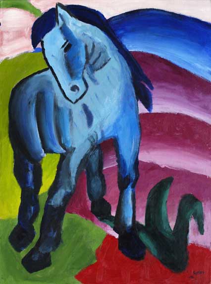
Blue Horse, another painting, Franz Marc

For Marc, particular colors had very specific meanings.  For example, blue signified masculinity or spirituality, and red symbolized violence.

DSC_0033

"Art is nothing but the expression of our dream; the more we surrender to it the closer we get to the inner truth of things, our dream-life, the true life that scorns questions and does not see them."    --Franz Marc

DSC_0056

I'm wearing a vintage silk blouse, thrifted Ellen Tracy silk skirt, vintage cardigan, Urban Outfitters socks, whistle pendant from the Brooklyn Flea, and Marni shoes.

DSC_0060
[Marc images from artmight.com, Leicester Arts and Museums Service, wikimedia.org, and karlshuker.blogspot.com, respectively.]

Friday, March 18, 2011

SCHIELE SUNFLOWERS


Now that spring is nearly upon us, I can't help but feel inspired by flowers. A traditional decorative art motif, sunflowers have often been depicted throughout art history, most notably by Monet and Van Gogh (see my Van Gogh sunflower post here).


Generally considered to be jubilant subject matter, sunflowers take on a macabre meaning in the works of Egon Schiele.


As I discussed in previous posts (here and here) Schiele (1890-1918) was an Austrian Expressionist painter who is well known for his hundreds of figural works, despite his tragically short life.


Many of the artistic techniques he employed in depictions of the human form are utilized in his paintings of sunflowers.


Spindly, emaciated, and somewhat sad, many art historians have seen Schiele's paintings of sunflowers as an analogy for his life and work.


Here is a wonderful short article by Michael Glover on Schiele's Sunflower II, which compares the work to the sunflower paintings of Monet and Van Gogh.


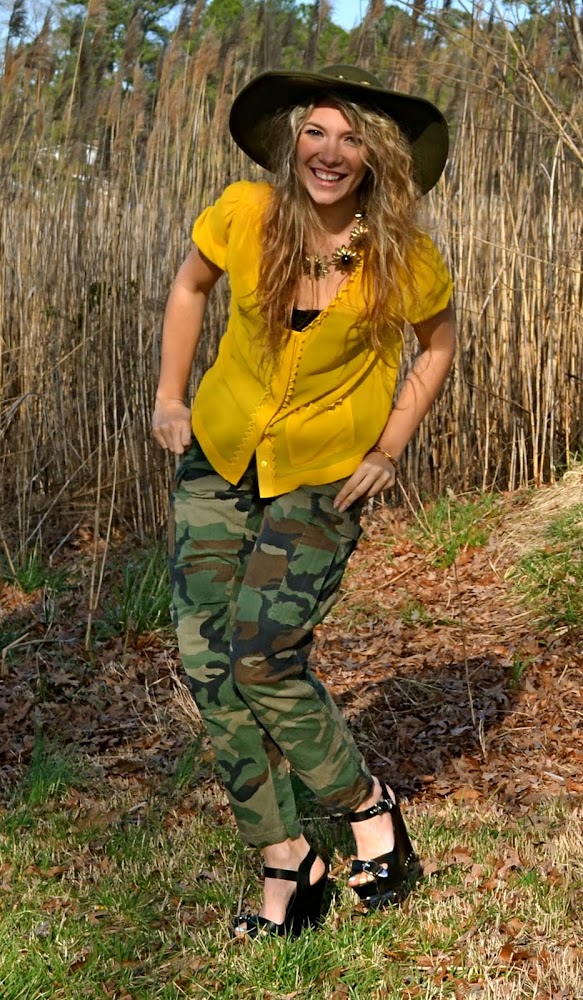
Inspired by Schiele's unique take on the common subject matter, I created an outfit that I hoped would express the character of the works.


I'm wearing a silk See by Chloe blouse, vintage hat, thrifted military issue cargo pants, suede Lauren Merkin clutch, and leather Dolce Vita wedges.
The necklace was a Christmas gift (thank you, Kristen!) and the lovely sunflower bracelet was made by my Aunt, using Swarovski crystals. You can visit her Etsy shop here.


Over the next few weeks, I'll be traveling through San Francisco, Honolulu, and Atlanta. I would love to hear suggestions of places to go/art to see, so feel free to leave a comment or email me!


[Schiele images from oceansbridge.com, saleoilpaintings.com, and oilpaintings-sales.com, respectively.]

Tuesday, March 8, 2011

KIRCHNER'S COLORS


One of the main reasons I love art so much is that it is ruled by emotion--there is no right or wrong art. The same is true of fashion, to an extent. Though there are trends and forecasters who predict what will be "in" and "out", one's personal style ultimately relies on one's own emotion and how they choose to express themselves.


Have you ever awoken in a slump and combatted the mood by wearing your favorite dress or brightest tee?


Expressionism has always been among my favorite art movements because of its ability to do just that--capture emotion through color. This idea is evidenced in the work of Ernst Ludwig Kirchner.


Kirchner (1880-1938) was the most important member of Die Brücke, a group of Dresden artists who championed primitivism, bold color, and abstraction. His most known works are of Berlin street scenes; however, the works shown here depict other figural subject matter that is equally compelling.


Kirchner used bold, almost neon, hues of orange and green to give his works a vibrating sense of color and depth. Themes of primitivism and the exotic are also apparent in these works, important aspects of Die Brücke Manifesto.


To emulate the feel of these paintings, I paired Kirchner's go-to colors, green and neon orange, with a few "exotic" elements--leopard and zebra.


This skirt was a recent thrift find--part Jil Sander, part Royal Tenenbaums. I think it will prove to be quite versatile. Yes, I consider a pleated green zebra-print midi skirt to be a versatile piece. Like I said, there is no wrong answer in fashion!


I'm wearing a handknit vintage cardigan (which is even more neon in person--like construction worker orange), vintage silk blouse, vintage silk pleated skirt, Abercrombie & Fitch leather skinny belt, vintage leather clutch, Juicy Couture leather lace-up booties, and F21 rings.


Thank you to Aesthetic Alterations for the Stylish Blogger Award!

[Kirchner images from artinvestment.ru, flickr.com, and members.cox.net, respectively.]

Tuesday, February 15, 2011

COLOR CUES


Although one of the best ways to gain inspiration is through art books, I believe that art is best experienced firsthand. There is nothing comparable to standing before a Boticelli or a Pollock for the first time, and it is an experience one does not easily forget.


Color is one thing that is never fully justified in reproductions. After looking at photos, slides, and jpegs of paintings by Wassily Kandinsky (1866-1944), nothing could compare to seeing one in person. The colors are so bold and vibrant, they are nearly overwhelming.


It's easy to be inspired by Kandinsky wardrobe-wise, what with the multitude of bright colors and interesting shapes. One aspect of his work that I've been picking up in my personal style recently is the striking combination of purple and red.


Nearly all of Kandinsky's paintings feature this color duality, and, though the two colors reside next to eachother on the color wheel, the result is still very bold.


As I shared before, Kandinsky's primary motivation in his work was composition, but clearly his use of color is equally strong.


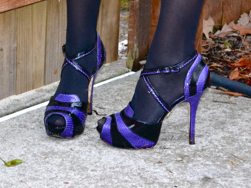
For this outfit, I decided to take some cues from Kandinsky's color scheme and juxtapose purple and red with black accents, and a pair of shoes that could probably be camouflaged into a Kandinsky painting.

I'm wearing a vintage blouse and jacket, vintage leather skirt, Betsey Johnson leather clutch, and L.A.M.B. reptile heels.


[Kandinsky images from russianavantgard.com, dosiamckay.wordpress.com, and artobserved.com, respectively.]